Hi Everyone
")
Last week I finally upgraded the web design template for Movie Studio Zen, so that it now displays properly on ALL mobile devices.
That means it will now automatically shrink/scale down when viewed on a Phone or Tablet of any size.
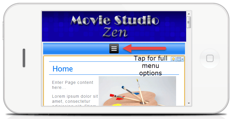
When it shrinks on a mobile device, you will see the TOP MENU bar change to this (see picture below).
To access all the normal menu options, simply tap the the small black box with three lines in it and a full list will appear.
If you are viewing the website right now on a normal desktop display, try dragging your web browsers window in to a much smaller rectangle and you will see how the entire website shrinks in a proportional way.
Please let me know if you ever have problems viewing the website or find bugs - if know one reports these things I am in the dark.
ℹ️ Remember to turn everything off at least once a week, including your brain, then sit somewhere quiet and just chill out.
Unplugging is the best way to find solutions to your problems. If you would like to share some love, post a customer testimonial or make a donation.
The topic has been locked.
